
The Fancy Cow Wines
Brand Identity
Label Design
Packaging Design
Logo Design
Client: Marlborough Vintners
VISION:
This project was centred around creating a distinctive on-premise wine label series for The Fancy Cow — a venue already known for its personality, charm, and strong visual identity.
The goal was to translate that existing brand world into a wine offering that felt seamlessly connected, while still standing confidently on its own. These labels needed to do more than identify a varietal, they were there to enhance the dining experience, spark conversation at the table, and reflect the restaurant’s playful yet premium positioning.
At the heart of the concept was the idea of elevated approachability. The wines needed to feel fun, expressive, and easy to engage with, while still carrying a sense of quality and considered design that aligned with a Marlborough wine experience.
The existing brand character, Fanta the Highland Cow, became the natural hero from the existing brand — acting as a recognisable and ownable anchor across the range. The vision was to build a series that felt cohesive, memorable, and uniquely “Fancy Cow,” while celebrating the individuality of each wine.
PATH:
Building from the established brand identity created by Fresh Designs, the design approach focused on layering premium cues with playful expression.
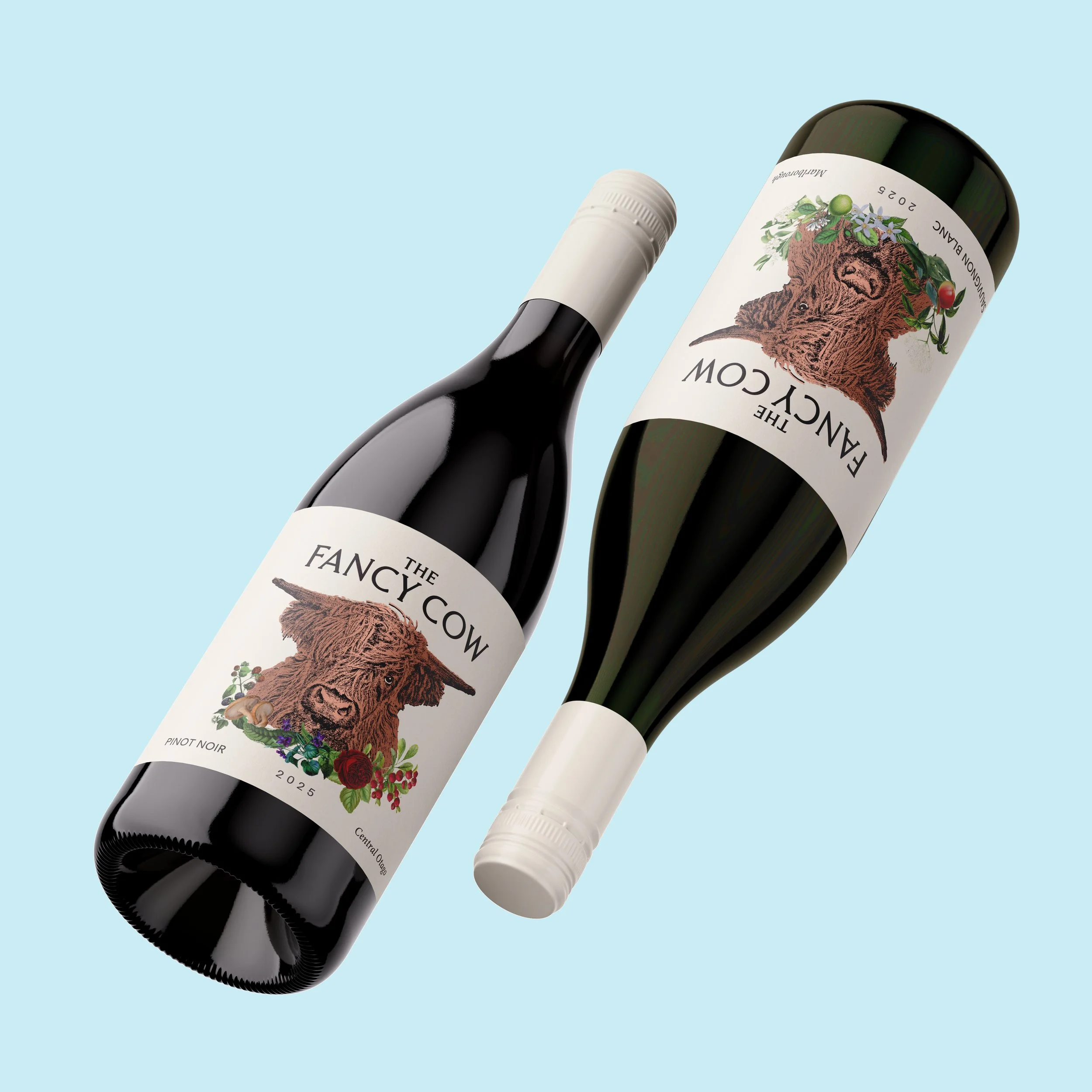
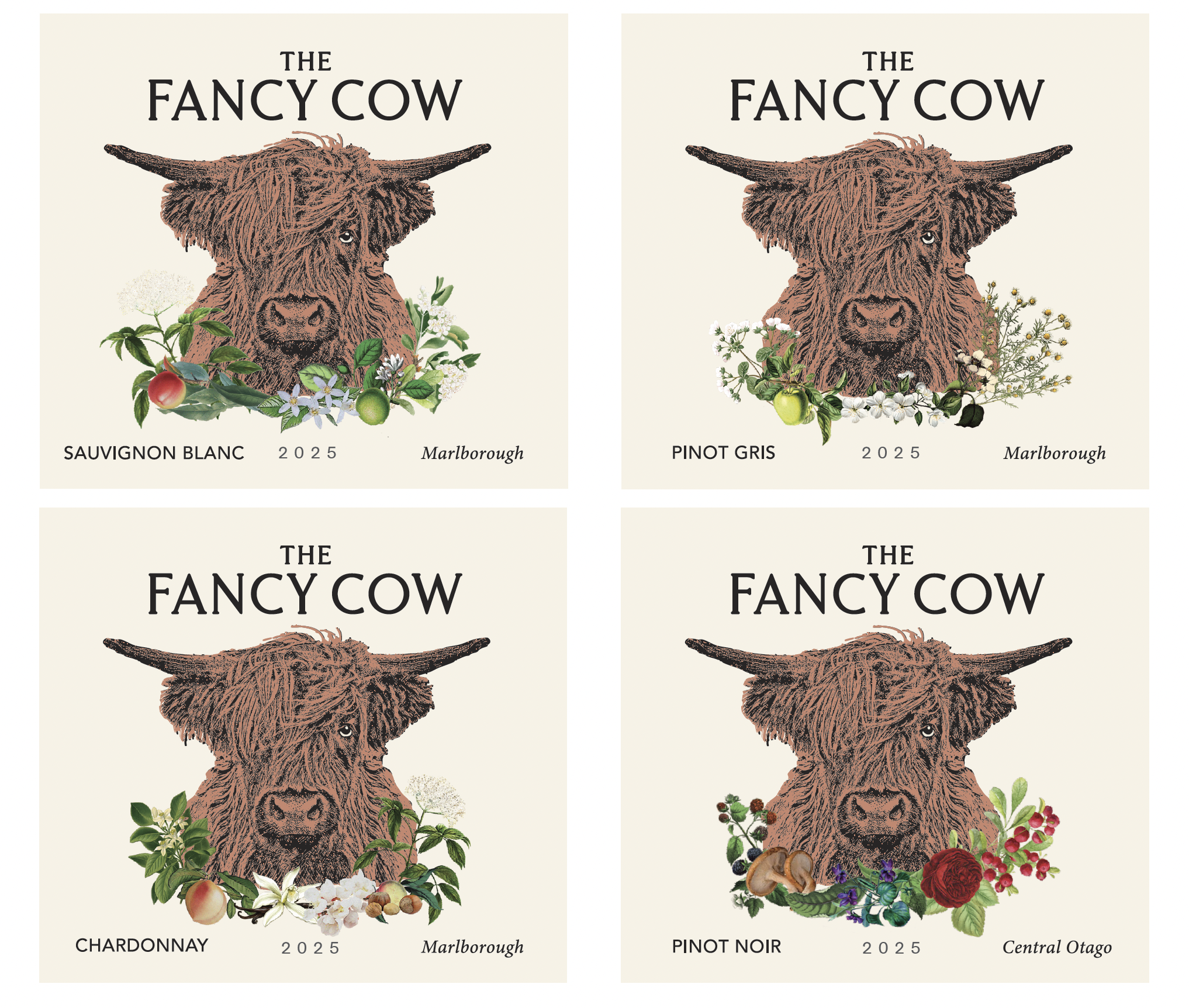
Fanta the Highland Cow was brought forward as the central figure on each label — reinforcing brand recognition and creating an immediate emotional connection. Around this hero element, the design system was expanded to introduce richness, depth, and variety across the range.
Copper foil was used as a key finishing detail to quite literally bring the “fancy” into The Fancy Cow. It adds warmth, tactility, and a premium edge, catching the light in a way that elevates the overall presentation in a restaurant setting. The copper colour reflects the colour of the highland cow shaggy coat.
To balance this, and to introduce vibrancy and storytelling, botanical-style illustrations were developed for each varietal. These illustrations reference the key aromas and flavour profiles of the wines — adding both a visual cue and a layer of discovery for the drinker. The organic nature of the botanicals softens the structure of the foil, creating a more approachable and expressive aesthetic.
Colour played an important role in differentiating the range, with each varietal carrying its own palette while still sitting cohesively within the broader system. This ensured the labels felt creative and engaging as a collection, while remaining easy to navigate at a glance.
The result is a label series that balances character and craft — where premium finishes, thoughtful illustration, and a strong brand hero come together to create a memorable on-premise experience.