The Infamous Goose Sauvignon Blanc
Brand Identity - new brand story
Label Design
Packaging Design
Logo Design
Client: Craggy Range
VISION:
The decision to rebrand The Infamous Goose Sauvignon Blanc wine stemmed from the recognition that, while the wine itself was of high quality, the brand lacked a strong and distinctive USP. As described by the client, “Other than great wine quality, there are currently no strong USP’s for the brand. It’s a stereotypical ‘virtual brand’ with no real identity or reason for being, hence we are now struggling, as trade and consumers have come to expect more from wine brands in an increasingly competitive market.” The wine is sold by Kobrand Fine Wines & Spirits in the USA.
The challenge was to retain the same brand name but concept a new brand story that was authentic both to the product and its origins.
The original branding for The Infamous Goose Sauvignon Blanc lacked a compelling point of difference, relying heavily on a generic “critter label” approach that failed to communicate any authentic story, provenance, or emotional connection with consumers.
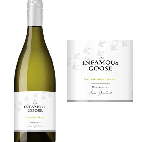
The original label design.
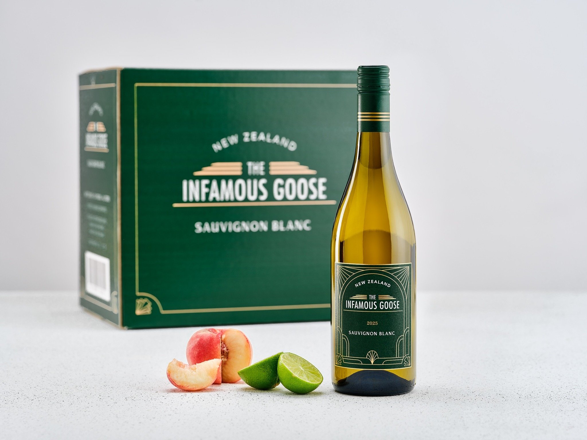
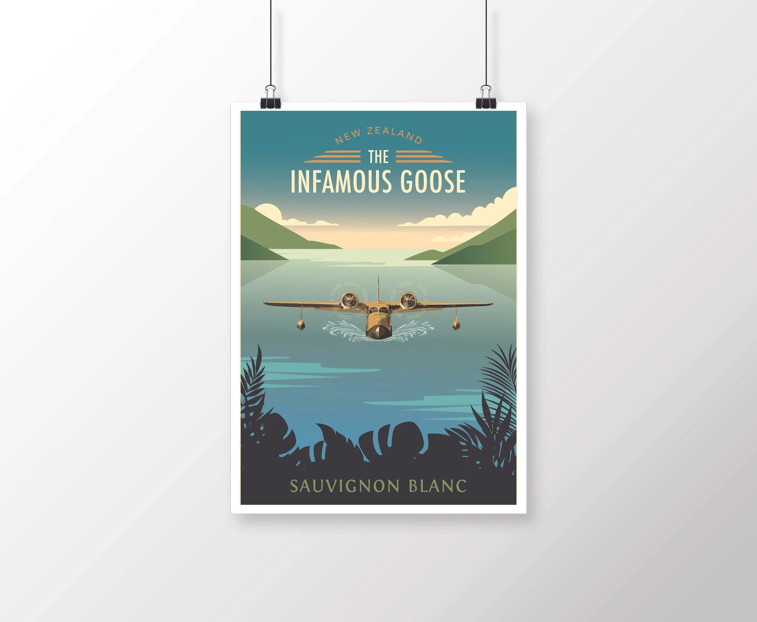
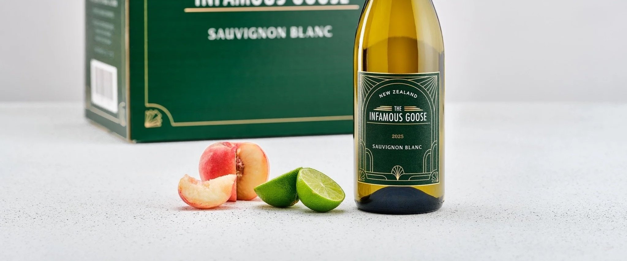
The rebrand transformed the wine into a richly layered and distinctive brand by drawing inspiration from the legendary Grumman Goose seaplane ZK-DFC and its remarkable role in New Zealand aviation history. First built in 1930s America for wealthy island-hoppers before serving in naval patrols, the aircraft arrived in New Zealand in 1972 after an extraordinary 16,000 mile journey across the globe. In Aotearoa, she became a lifeline to remote communities, delivering mail, navigating rugged coastlines, and earning a reputation for being fearless, adventurous, resilient, and charming, eventually becoming known as “The Infamous Goose.”
The new packaging and brand story pay tribute to this iconic aircraft, creating a far more meaningful and memorable identity that celebrates New Zealand’s aviation heritage, untamed landscapes, and spirit of independence and adventure.
Sold in the United States, the brand story also completes a meaningful full-circle narrative, paying tribute to an aircraft originally built in America before becoming an icon of New Zealand aviation history and eventually returning to the USA decades later.
PATH:
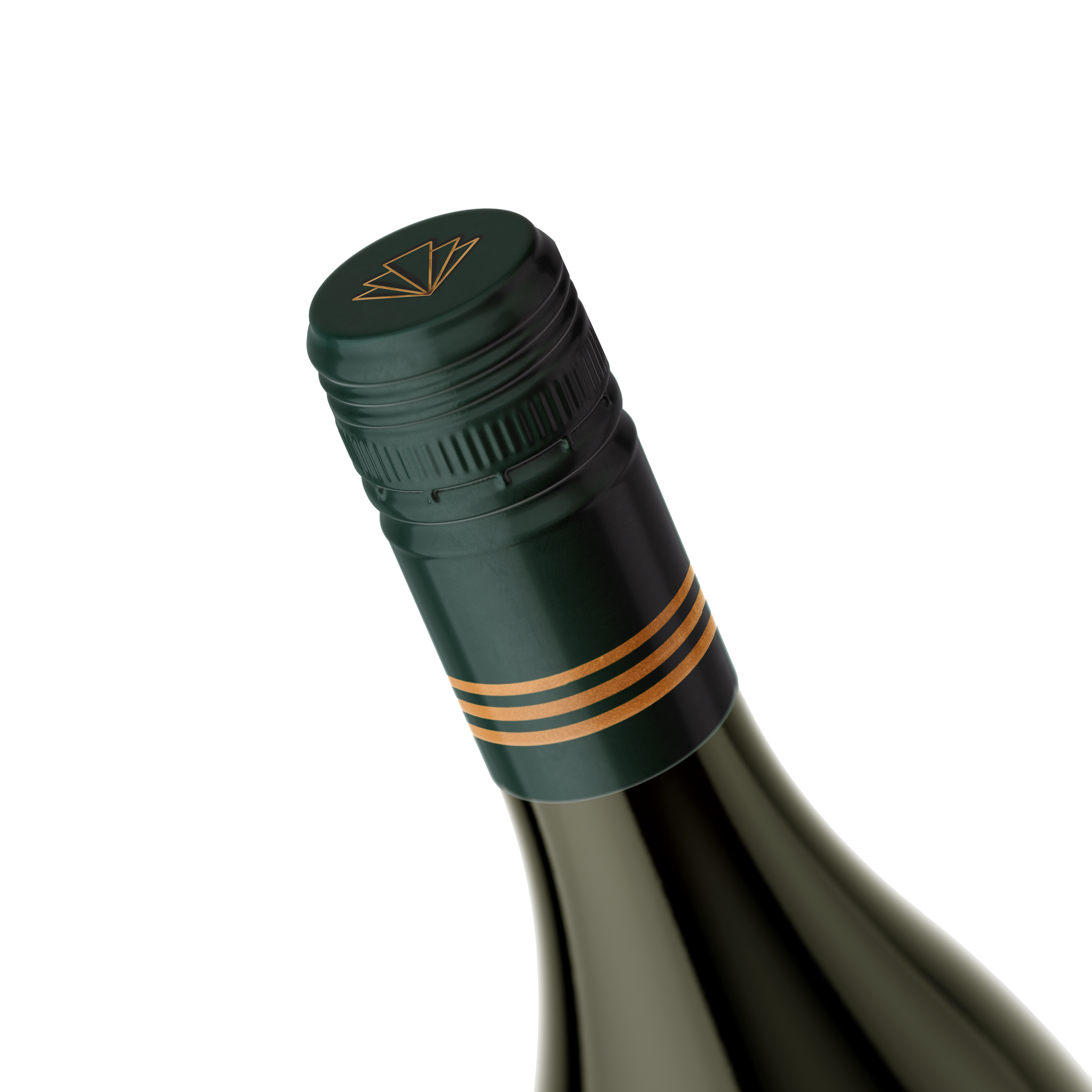
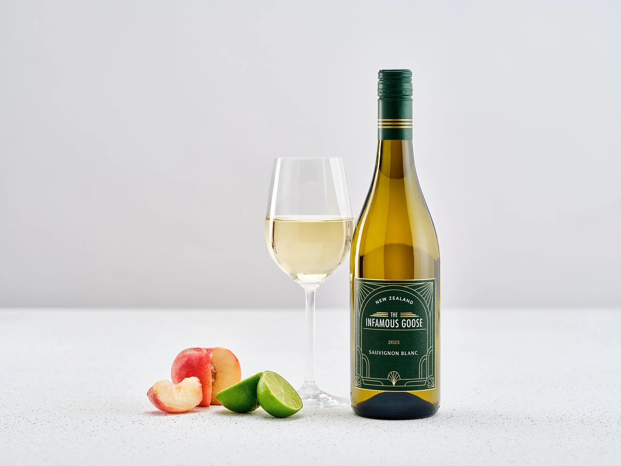
The new packaging design for The Infamous Goose Sauvignon Blanc draws heavily from the glamour and sophistication of the Art Deco era, a period closely tied to the golden age of aviation in which the Grumman Goose seaplane first emerged. The elegant geometric linework and symmetrical detailing reference the streamlined aesthetics of 1930s aviation and travel posters, while the arched curves within the label subtly mirror the distinctive shape of the aircraft’s windscreen and cockpit windows. The custom logo typography takes inspiration from vintage aviation insignia and aircraft markings, reinforcing the wine’s connection to New Zealand aviation history. A rich deep green palette paired with refined gold detailing elevates the overall design, creating a sense of timeless luxury, adventure, and sophistication while giving the brand a far more premium and distinctive shelf presence.