Wai Wai Wines
Brand Identity
Illustration
Label Design
Packaging Design
Logo Design
Client: Marlborough Vintners
VISION:
The Wai Wai label redesign is grounded in a simple but powerful idea: wai — water — as the lifeblood of both the land and winemaking.
Inspired by the pristine streams, rainfall, and waterways that flow through Marlborough, the vision was to create a brand that reflects not just a physical resource, but a deeper philosophy. In Te Reo Māori, wai represents more than water — it speaks to balance, vitality, and the interconnectedness of all living things.
The objective was to express this connection in a way that feels both authentic and contemporary. A brand that honours the relationship between land, water, and vine — while communicating a sense of purity, life, and natural harmony to the drinker.
At its core, the vision was to create a label that feels alive and reflective of its environment — one that captures the essence of Marlborough’s landscape and translates it into a visual language that is calm, considered, and enduring.
“From the pristine streams that flow through our vineyards, to the waterways filled by rainfall, wai is the lifeblood of winemaking.”
PATH:
The design approach focused on visually expressing the relationship between land and wai — not as separate elements, but as a continuous, interdependent system.
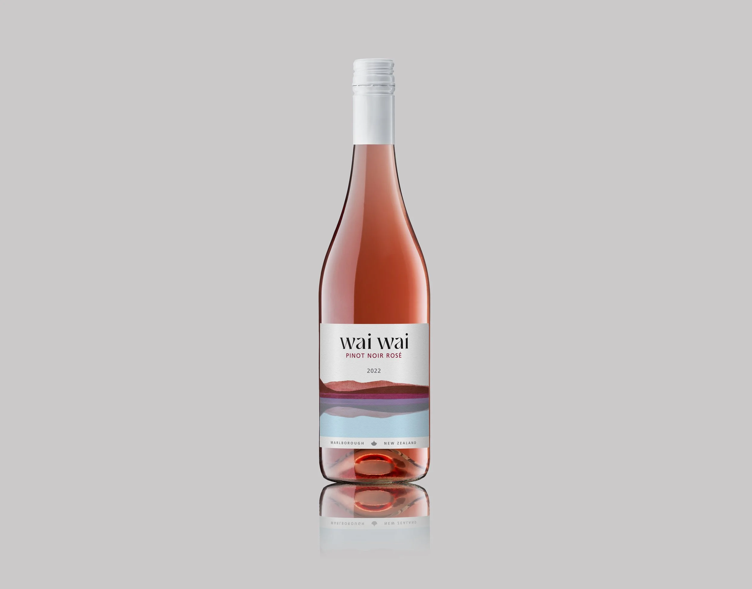
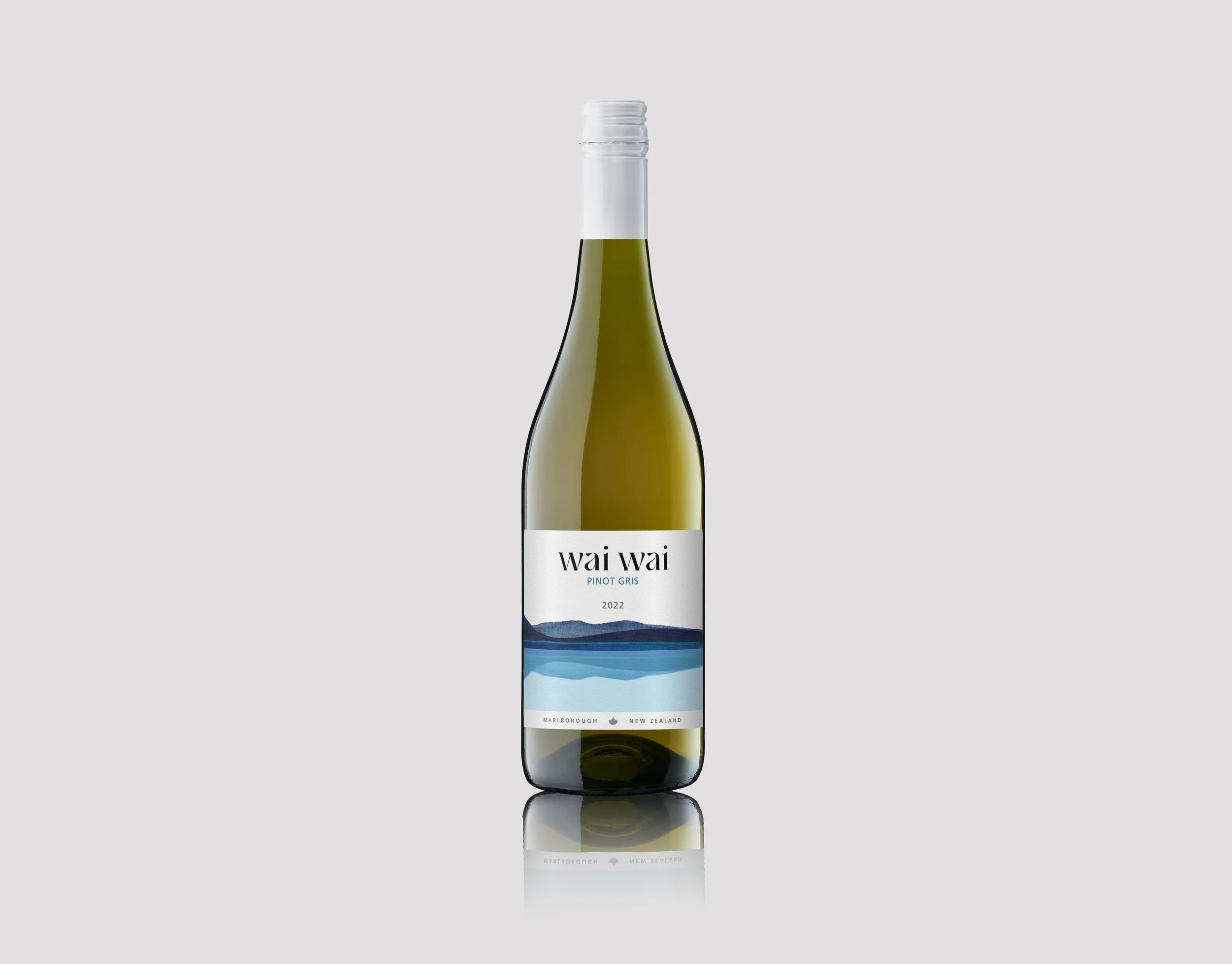
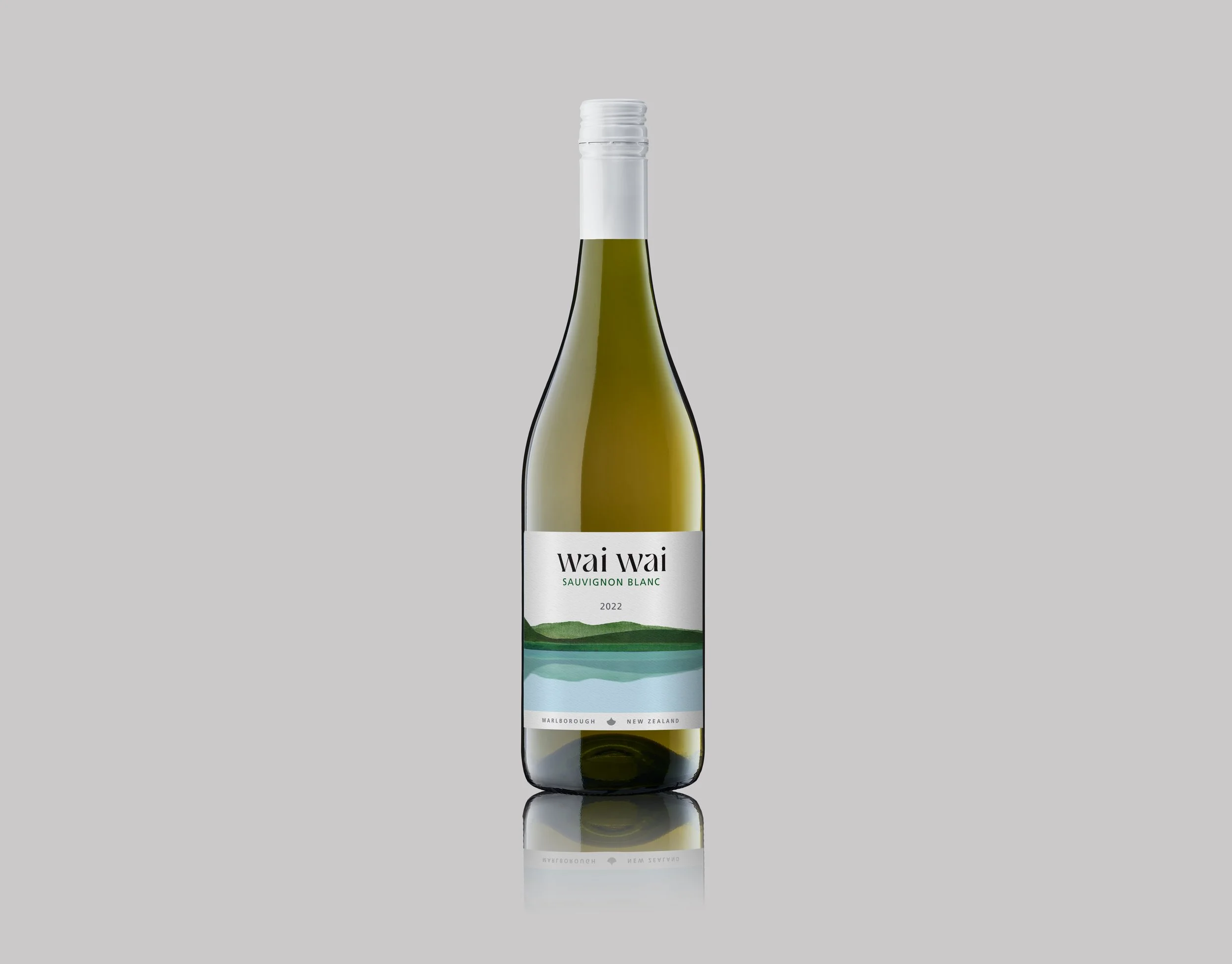
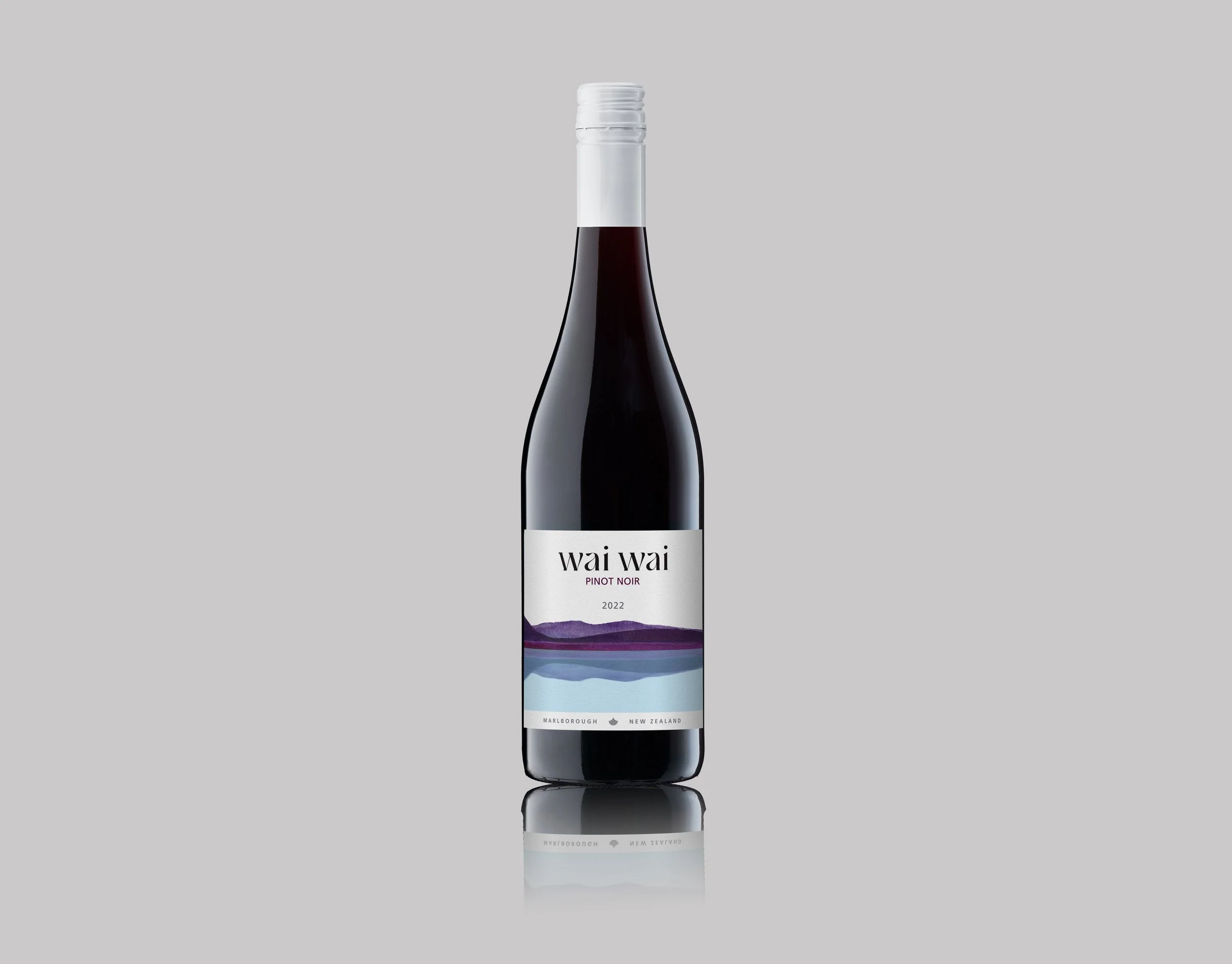
Illustrated watercolour landscapes inspired by Marlborough’s enveloping hills were developed as a central feature of the label. The hills are generic enough to represent other regions should the grapes be sourced from elsewhere. These forms are mirrored and reflected within water, creating a duality that is both literal and symbolic. The reflection device reinforces the idea that land and water are intrinsically linked — each shaping and sustaining the other.
The watercolour illustrations use soft, earthy tones inspired by the landscape and varietals.
This layered visual storytelling allows the label to communicate depth and meaning without overwhelming the viewer. It invites a moment of pause — a quiet recognition of place and origin.
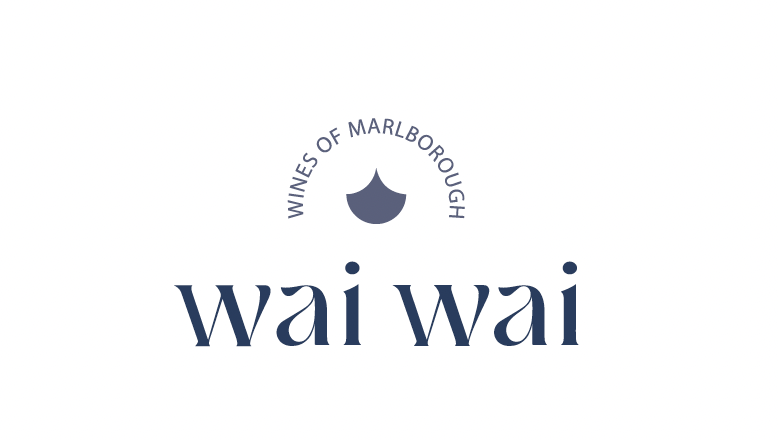
The wai wai word mark was designed to stylistically suggest the movement and flow of wai in a modern, contemporary way. The accompanying logomark is derived from a carved ‘w’ within a circular form, creating a stylised water droplet. This circular shape reinforces ideas of continuity, life, and natural cycles. Balance is central to the mark — the left and right sides mirror one another, reflecting the interconnectedness and harmony between land and water that sits at the heart of the Wai Wai story.
This philosophy extends beyond the label. The wines crafted by Marlborough Vintners reflect the same harmony — expressing freshness, vibrancy, and layered complexity that speak directly to their origin.
Sustainability also plays a key role in the story. With a commitment to responsible vineyard practices, the brand narrative aligns closely with the idea that protecting the land and its waterways is essential to preserving both quality and future potential.
The result is a label system that feels thoughtful, grounded, and connected, a visual expression of wai as both a life force and a guiding principle, brought to life through design.